


How to Use Typography to Strengthen Your Brand Identity:
-
Admin_Techhub / 4 years
- June 20, 2022
- 0
- 4 min read

Typography is often an overlooked aspect of branding, but it plays a critical role in shaping the way your brand is perceived. The right typography can convey your brand’s personality, improve readability, and enhance the overall customer experience. In this blog, we’ll explore how to use typography effectively to strengthen your brand identity.
1. Understand the Role of Typography in Branding:
Typography refers to the style, arrangement, and appearance of text. It’s more than just choosing a font; it’s about selecting the right typefaces, weights, and sizes to communicate your brand’s tone and personality. Typography can influence how your audience feels about your brand and how they engage with your content.
-
Fonts as personality: Just like colors, fonts can convey different emotions. Serif fonts (e.g., Times New Roman) are often associated with tradition and formality, while sans-serif fonts (e.g., Arial) are seen as modern and clean.
-
Legibility and accessibility: Good typography ensures that your message is clear and easy to read across all devices and mediums.
2. Choose the Right Typeface for Your Brand:
The font you choose should align with your brand’s personality and resonate with your target audience. Start by asking yourself these questions:
-
Is my brand formal, casual, playful, or serious?
-
Does my brand cater to a young, trendy audience or a more professional, established demographic?
-
How do I want my customers to feel when they see my content?
Based on these answers, choose a font that reflects your brand’s personality. For example:
-
Luxury brands might opt for elegant, serif fonts to evoke sophistication (e.g., Gucci).
-
Tech startups may prefer sleek, modern sans-serif fonts for a contemporary feel (e.g., Apple).
-
Children’s brands often use playful, rounded fonts to appear friendly and approachable (e.g., Disney).
3. Use a Font Pairing System:
Using more than one font in your branding can add variety and hierarchy to your design, but it’s important to pair fonts that complement each other. Generally, it’s recommended to use two to three fonts—one for headlines, one for body copy, and possibly one for accents or calls to action.
Here’s how to pair fonts effectively:
-
Complementary fonts: Pair a serif font with a sans-serif font to create contrast and balance. For example, you might use a serif font for headings and a sans-serif for body text.
-
Contrasting weights: Use bold or heavy fonts for emphasis and lighter fonts for readability. This helps create a visual hierarchy and guides the reader’s attention.
4. Focus on Readability:
While choosing stylish fonts is important, readability should always be your top priority. If your audience can’t read your content easily, they’re unlikely to engage with it.
Consider these readability best practices:
-
Font size: Ensure your text is large enough to be read on all devices, especially for body copy. The general rule is to keep body text between 14–18px for web use.
-
Line length: Keep line lengths between 50-75 characters for optimal reading comfort.
-
Contrast: Make sure there’s enough contrast between the text color and background. Dark text on a light background is easiest to read.
5. Maintain Consistency Across Channels:
Just like with visual elements like colors and logos, consistency in typography is crucial for brand recognition. Your typography should be uniform across all channels, including your website, social media, print materials, and email newsletters.
Create a style guide that outlines your font choices, sizes, and usage rules to ensure consistency across all platforms. This will help reinforce your brand identity and create a cohesive experience for your audience.
6. Test and Optimize Your Typography:
Typography isn’t a “set it and forget it” element of your brand. As you grow and expand, you may need to make adjustments to your fonts or layout to keep up with trends or improve readability. Test different font choices, sizes, and combinations to see how they affect user engagement and conversion rates.
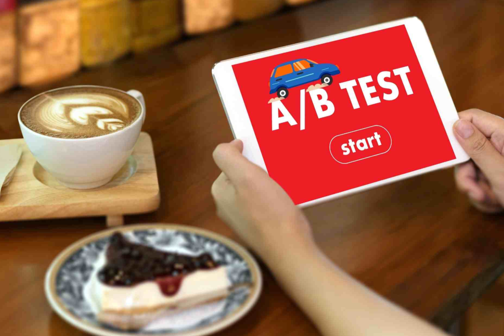
Conduct A/B testing on your website or emails to determine which typography choices lead to higher click-through rates, better engagement, and more conversions.
Conclusion:
Typography is a powerful tool for strengthening your brand identity. By choosing the right fonts, creating font pairings, focusing on readability, and maintaining consistency across all channels, you can enhance the way your brand is perceived. Typography plays a key role in communicating your brand’s personality, improving user experience, and increasing engagement with your audience.