


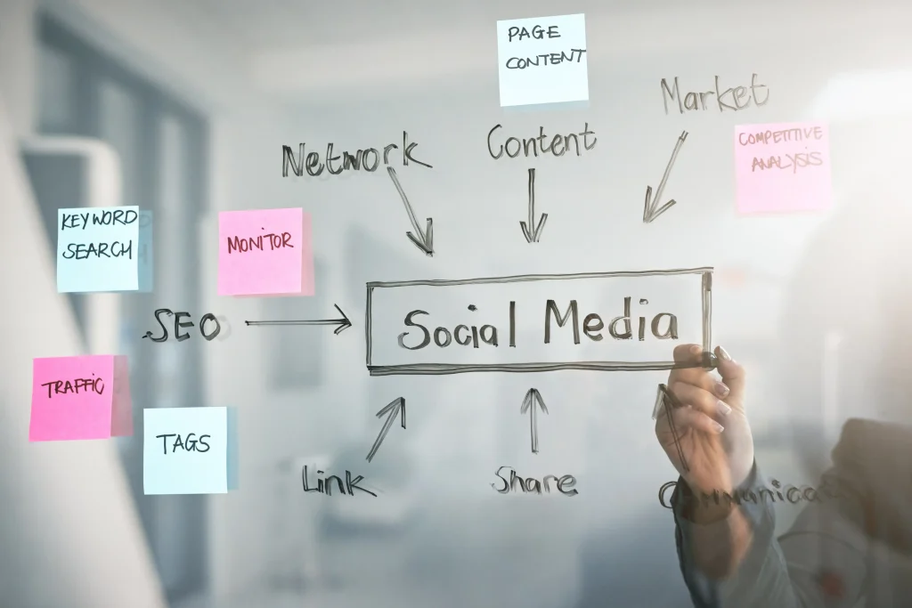


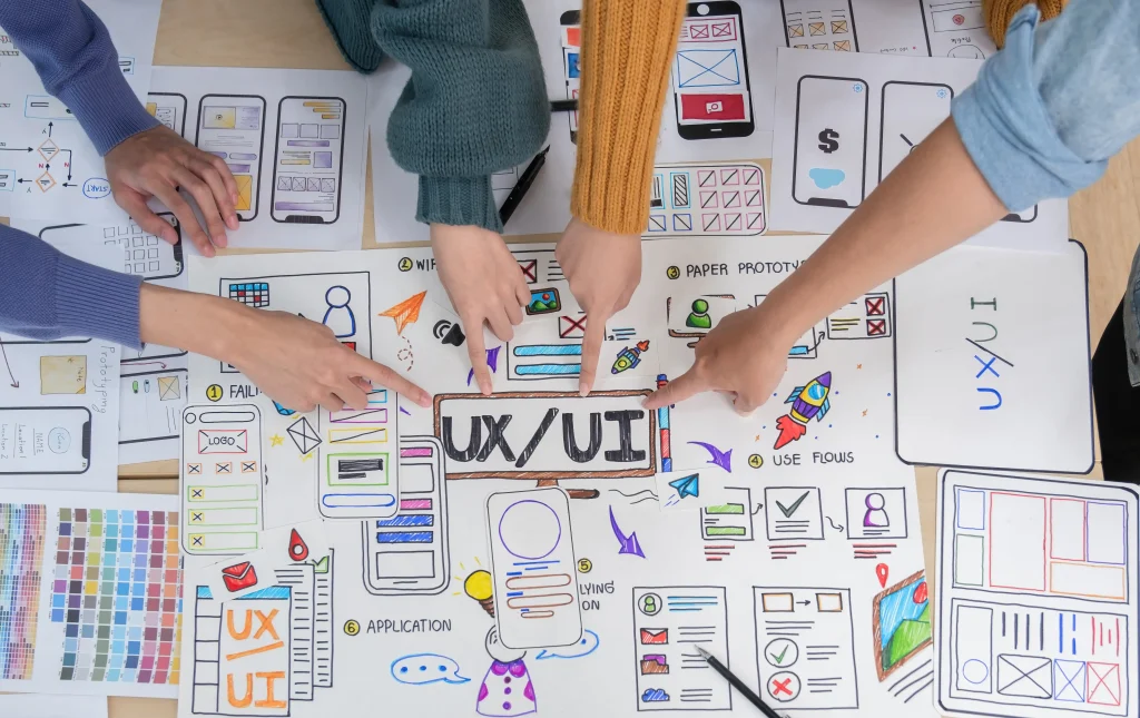
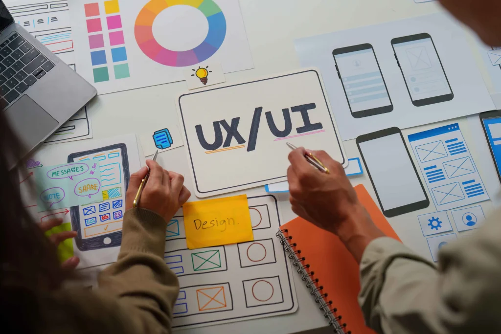


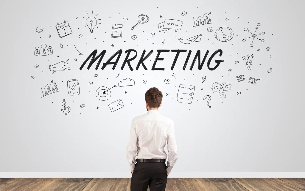


How to Integrate UX/UI Design with Your Marketing Funnel for Maximum Results:
The success of your marketing funnel depends not only on your messaging and targeting but also on how well your website or landing pages are designed. The seamless integration of user experience (UX) and user interface (UI) design within your marketing funnel can significantly enhance the user journey and improve conversion rates. In this blog, we’ll explore how UX/UI design can align with your marketing funnel to optimize customer experiences and drive maximum results.
1. Understand the Stages of Your Marketing Funnel:
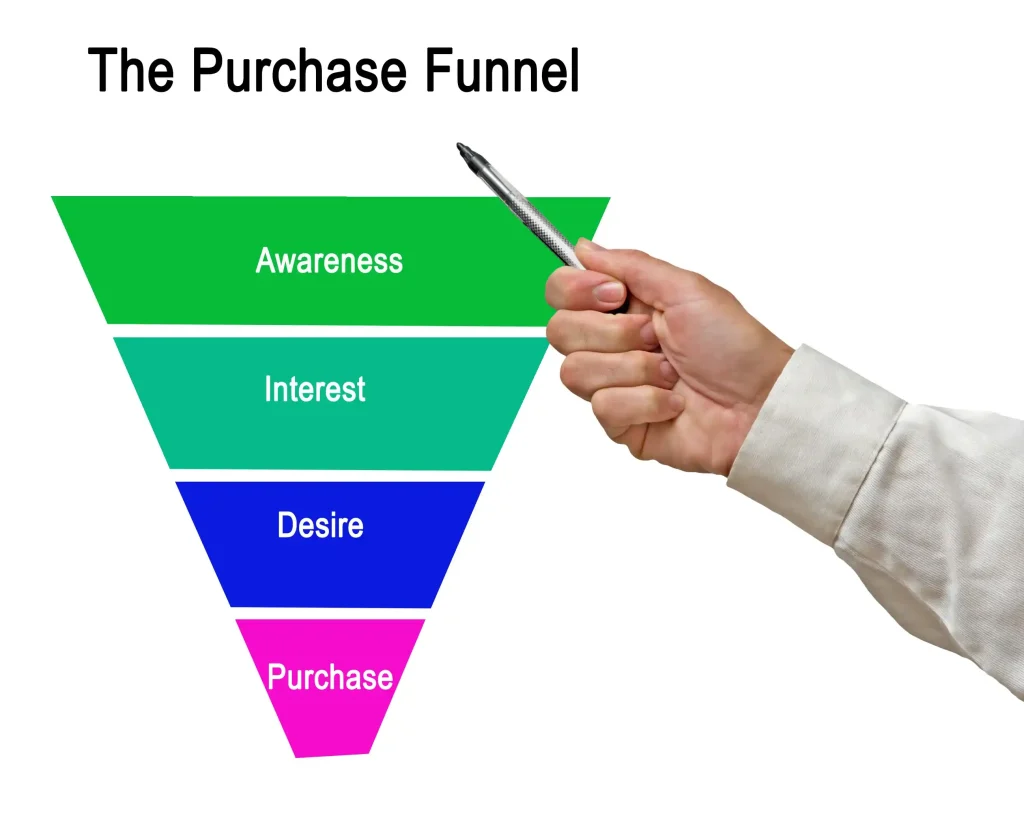
Before integrating UX/UI design into your marketing funnel, it’s important to understand the different stages of the funnel and how users move through them. Typically, a marketing funnel consists of three stages:
-
Top of the Funnel (TOFU): Awareness stage where users are discovering your brand or product.
-
Middle of the Funnel (MOFU): Consideration stage where users are evaluating your product as a potential solution.
-
Bottom of the Funnel (BOFU): Conversion stage where users are ready to take action, such as making a purchase or signing up.
Each stage of the funnel requires different UX/UI strategies to guide users toward their next step in the process.
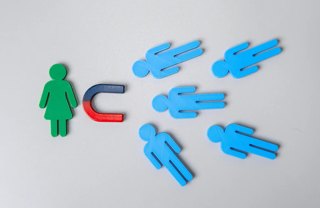
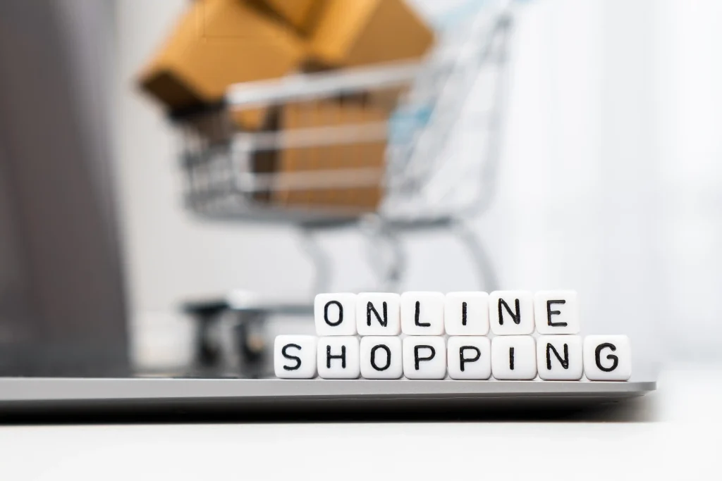
2. Design for the Awareness Stage (TOFU):
In the awareness stage, the goal is to attract potential customers and make a positive first impression. At this point, users are learning about your brand, so it’s essential to create an engaging and welcoming design.
UX/UI best practices for TOFU:
-
Clear, compelling messaging: Your design should prominently feature headlines that clearly convey your brand’s value proposition.
-
Visual appeal: Use high-quality visuals and engaging design elements to capture attention without overwhelming the user.
-
Easy navigation: Make it easy for users to explore more about your brand, services, or products. Use simple, intuitive navigation menus and clear call-to-action (CTA) buttons.
At this stage, the goal is to spark interest and direct users deeper into the funnel by offering resources like blog posts, eBooks, or webinars.
3. Design for the Consideration Stage (MOFU):
In the consideration stage, users are evaluating different solutions to their problems. Here, your goal is to provide relevant content and information that positions your product or service as the best solution.
UX/UI best practices for MOFU:
-
Clear value propositions: Highlight the specific benefits of your product or service and how it addresses the user’s pain points.
-
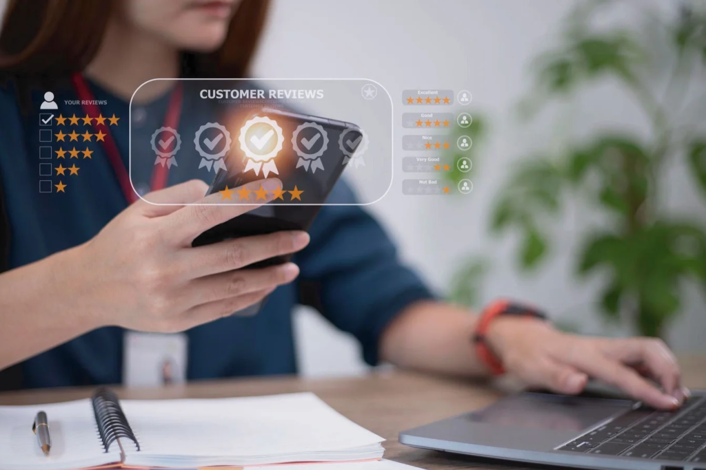
Social proof: Use testimonials, reviews, case studies, and trust signals to build credibility and encourage users to trust your brand.
-
Lead capture forms: Design lead capture forms that are simple and easy to fill out. Use progressive profiling to gradually ask for more information as users interact with your brand.
The design of your landing pages, product descriptions, and content should reinforce your brand’s value and encourage users to move further down the funnel.
4. Design for the Conversion Stage (BOFU):
The conversion stage is where users are ready to make a decision. Here, your UX/UI design should make it as easy as possible for users to take the desired action—whether it’s purchasing a product, signing up for a service, or requesting a demo.
UX/UI best practices for BOFU:
-
Clear and prominent CTAs: Your call-to-action buttons should stand out and be placed strategically on the page. Use action-oriented language such as “Get Started” or “Buy Now.”
-
Simple checkout process: If you’re selling a product, the checkout process should be as streamlined as possible. Minimize the number of steps required and provide clear progress indicators.
-
Reassurance and trust signals: Use trust badges, secure payment icons, and easy-to-find contact information to reassure users that their information is safe.
At this stage, the design should reduce friction and encourage users to convert quickly.
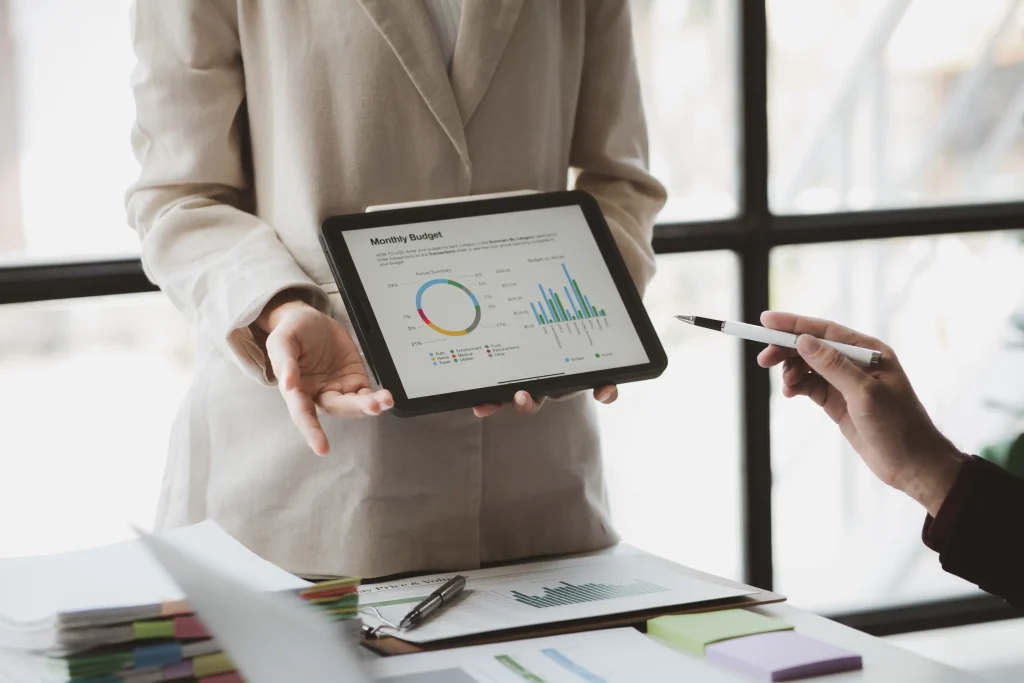
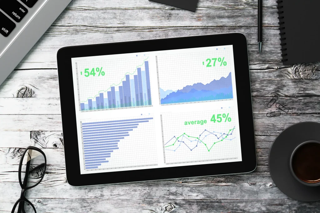
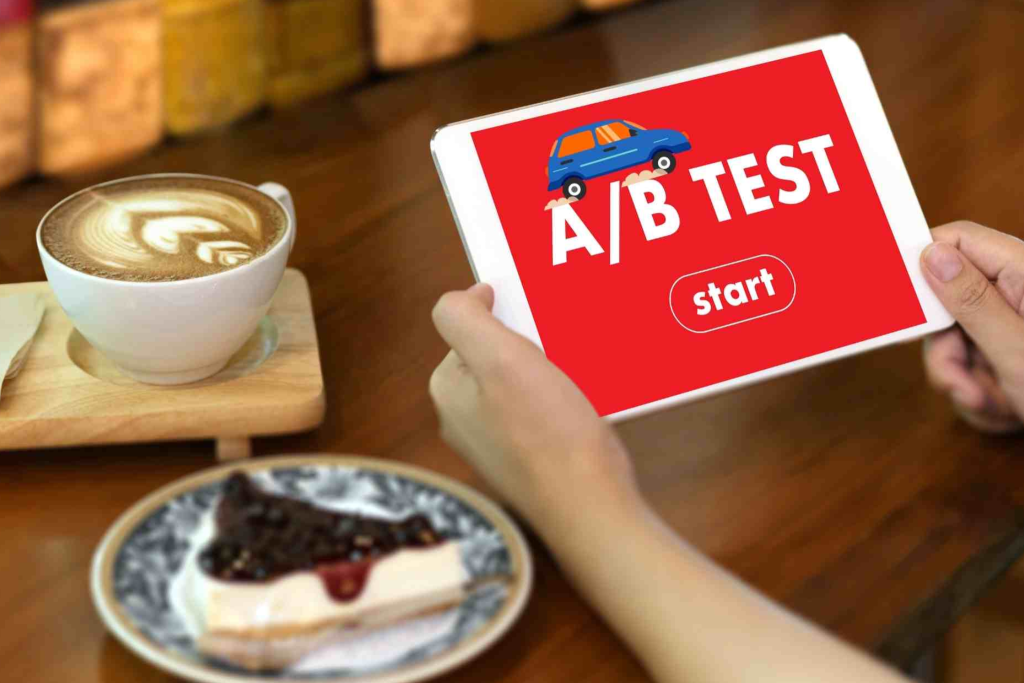
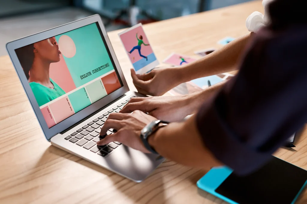
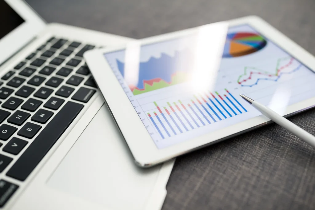
5. Continuously Test and Optimize UX/UI Elements:
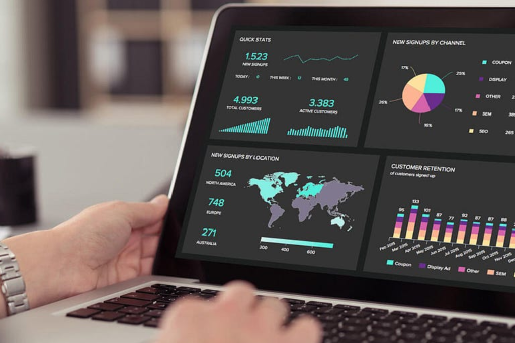
To maximize the effectiveness of your UX/UI design within your marketing funnel, you need to continuously test and optimize key elements. A/B testing, heatmaps, and user feedback can help identify areas where users are dropping off or experiencing friction.
-
Test CTAs: Experiment with different CTAs to see which wording, placement, and design resonate best with users.
-
Optimize forms: Simplify forms by asking only for essential information. Test form layouts and designs to improve completion rates.
-
Improve page speed: Slow-loading pages can lead to high bounce rates. Optimize images and minimize unnecessary elements to ensure fast load times.
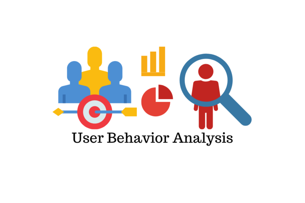
6. Keep the User Journey in Mind:
Every touchpoint in your marketing funnel should be designed with the user journey in mind. Ensure that the transition between each stage is smooth and logical, guiding users effortlessly from one step to the next. For example, after users consume content in the TOFU stage, provide them with the option to download a resource in the MOFU stage, followed by a CTA to purchase or sign up in the BOFU stage.
Consistency across the funnel is key to maintaining a seamless user experience.
Conclusion:
Integrating UX/UI design with your marketing funnel is essential for providing a seamless and intuitive customer journey. By optimizing your design for each stage of the funnel—from awareness to conversion—you can create an experience that not only delights users but also drives higher engagement and conversions. Prioritize user-centered design, test your elements regularly, and ensure consistency across touchpoints to maximize results and improve the performance of your marketing funnel.